


Get to know your district with NYU Grossman’s new data tool
NYU’s Grossman School of Medicine launched a new online tool that displays key health data for all 435 U.S. congressional districts.
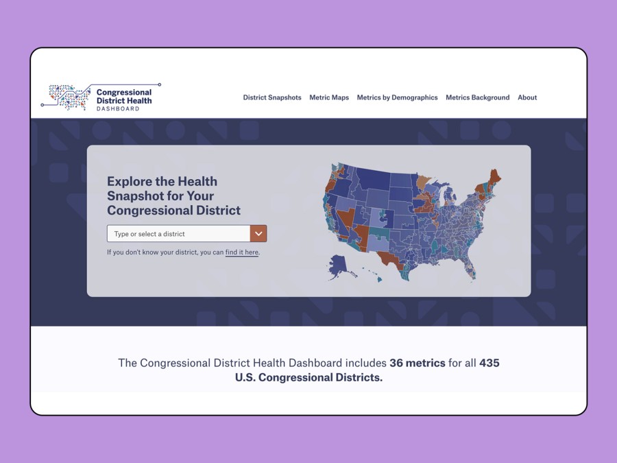
(Image via Congressional District Health Dashboard)
February 7, 2023
Researchers at NYU’s Grossman School of Medicine have launched an online dashboard that they hope politicians will use to help guide health policy decisions. The dashboard tracks 36 categories of data, including health outcomes, social and economic factors, health behavior, physical environment and clinical care in 435 congressional districts across the country.
According to the Congressional District Health Dashboard, New York’s 10th District — where NYU’s Washington Square campus is located — was rated as having a lead exposure risk of 10 out of 10 in 2020, compared with a national average of 5.5. Housing in this district has a 44.1% likelihood of exposing residents to lead, much higher than the U.S. average of 17.2%.
In 2018, academics at the medical school also created the City Health Dashboard, a similar database for over 900 cities nationwide that includes data on over 40 health metrics. While the City Health Dashboard focuses on neighborhoods and communities within cities, the new Congressional District Health Dashboard is designed for the needs of state and federal policymakers.
Becky Ofrane, the co-director of programs and administration for the health dashboard programs, said some of the areas in which she hopes the report will be most effective in helping legislators to improve maternal and child health, access to health insurance and broadband coverage — and reducing lead exposure.
“We had to do it on a really quick timeline because the congressional district boundaries were redrawn in 2022, based on the 2020 census,” Ofrane said. “We had to go state by state to collect those new geographic boundary files because they weren’t released broadly from the U.S. Census by the time we were developing the site.”
The dashboard is updated by health and policy experts when the raw data sources that the researchers use to calculate the health metrics become available — which typically happens once a year, according to Ben Spoer, the co-director of metrics and analytics of the health dashboard programs.
“Our team hopes that it puts front and center the health disparities — particularly around the social and economic drivers of health,” Ofrane said. “In a time of divided government and a lot of politics, our team hopes that this data can just really make clear some actions that policy-makers can take on health and equity.”
Contact Jenny Seo at [email protected].