


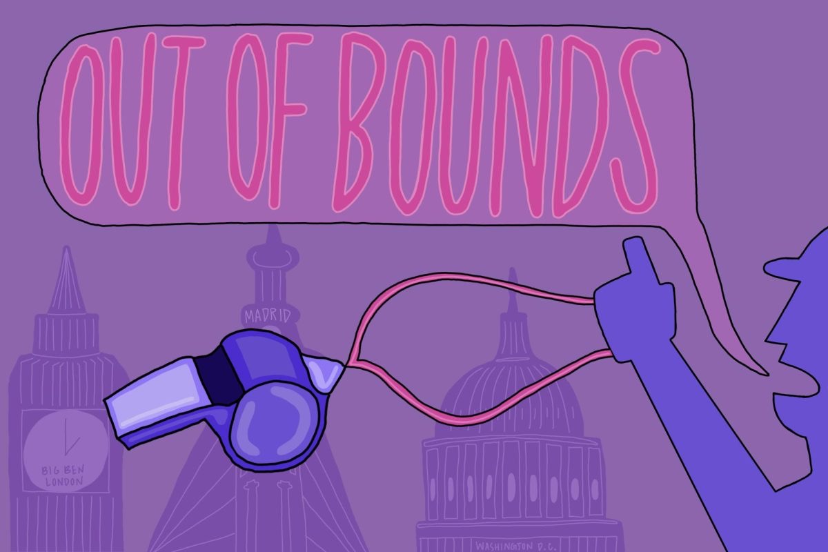
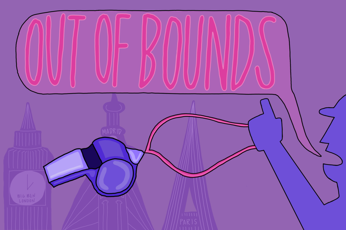
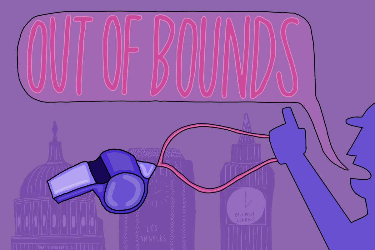
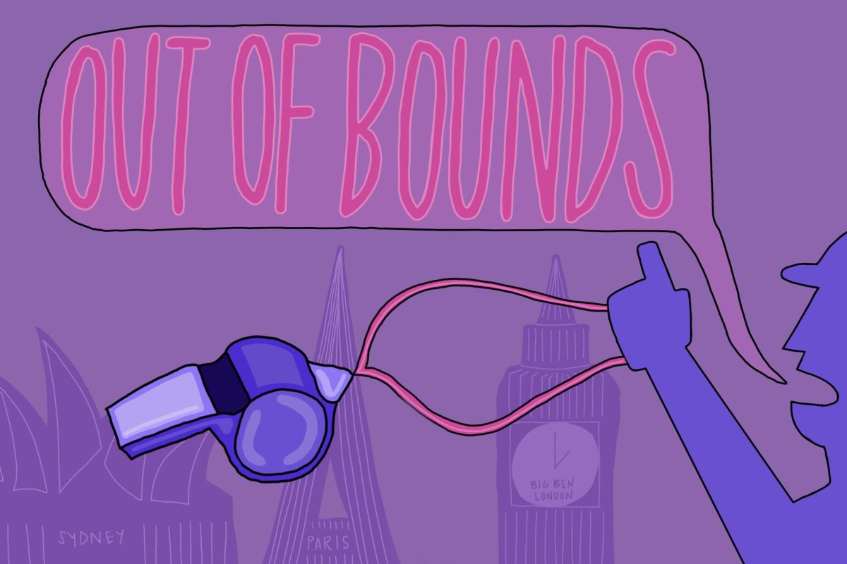


A new field of art that combines statistical data and creative presentation is on the rise, allowing viewers to connect with information in an innovative way.
“We are drowning in information, and we can’t keep up,” said R. Luke DuBois, assistant professor of integrated digital media at the Polytechnic Institute of NYU. “Just as data visualization helps us make sense of the ‘facts’ of our world, art made with data lets us look critically at those ‘facts.’”
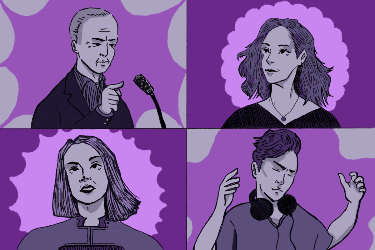
Doug Kanter, a senior in the Tisch School of the Arts Interactive Telecommunications Program, has used this methodology with his project Databetes. Kanter has been battling diabetes for 26 years and is currently working on a software program for people with the disease. He is currently a semi-finalist in the Stern Entrepreneur Challenge, where he could win a $200,000 grant.
Available for computers and mobile devices, Databetes is inspired by Kanter’s 2011 artwork “Databetes 7729,” which visualizes all 7,729 of his blood sugar readings from November 2011. The app’s tools include a network of fellow diabetics as well as colorful visualizations that make blood sugar levels easy to read.
“Medical information has historically been horribly presented,” Kanter said. “I’m really interested in tools to help patients directly because we just don’t have access to our doctors that often.”
Jer Thorp, who worked for The New York Times as a data artist in residence, agrees that new data visualizations are valuable to the average American.
“Most of the dialogue around data is being driven by corporate interests, and corporate desires don’t always align with the best interests of society,” Thorp said. “Artists can bring a critical voice to the discussion.”
Kanter’s 2011 piece, “American Military Casualties in Iraq,” also explores the human experience through data. Presented as a modified American flag, the work breaks down Iraq war casualties by state with horizontal red lines representing the wounded and varying sizes of stars reflecting the number of fatalities.
Commercial designer John Rothenberg created ReConstitution2012, which analyzed the 2012 presidential debates. His goal was to have viewers subjectively interpret the debate rather than absorb it through political pundits.
“Data is being used to tell stories on the news, and our role was to kind of investigate the artistic possibilities of that,” Rothenberg said. “What happens when we try to add these absurd statements to a presidential debate, and how does it feed back into our experience of the situation?”
Both Kanter and Rothenberg anticipate that data will continue to enter the two worlds as an innovative method of presenting facts and ideas.
“[Data] is part of our daily existence,” Rothenberg said. “Data is a story that’s not going away.”
“The bar keeps going up on trying to create something that’s different and engaging but also allows you to learn something from the data,” Kanter said.
A version of this article appeared in the Thursday, April 4 edition. Madeleine Overturf is a contributing writer. Email her at [email protected].
Michaela • Apr 4, 2013 at 6:20 pm
Nice article. In a broader sense, it reminded me of a TEDx talk I recently saw by Jer Thorp, the data artist in residence at the New York Times. It’s fairly long but definitely worth watching (he’s done some really impressive work in the space): http://www.youtube.com/watch?v=Q9wcvFkWpsM