Opinion: NYU’s new buildings represent the death of college charm
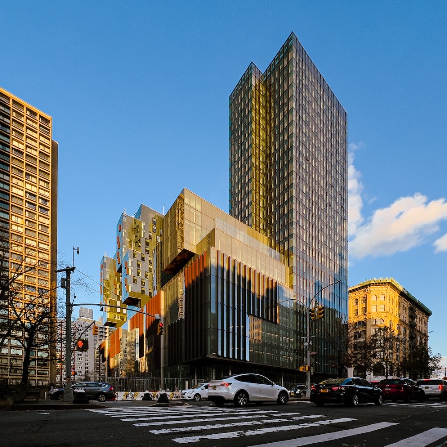
The newly-opened Paulson Center is just one example of how the dearth of beautiful Gothic architecture on college campuses is destroying the traditional university atmosphere.
(Kevin Wu for WSN)
March 27, 2023
On my first tour of NYU, I remember finding it odd how little traditional college architecture there was on campus. Between the daunting, brick behemoth that is Bobst Library and the glassy, modern vastness of the Paulson Center, NYU is missing the aura of wisdom and charm exuded by the Gothic architecture of traditional university buildings.
Bringing back Collegiate Gothic elements to its buildings would allow NYU to have a more cohesive atmosphere in what is a very disconnected city campus.
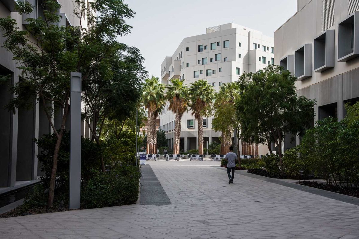
The new Paulson Center is one example of this disconnect. Although the building has met the mark in creating an abundance of academic, athletic and residential areas, its modernist architectural approach has resulted in wasted space and student disappointment. The glass paneling makes it look more like a corporate office than an educational institution.
A poll on the NYU subreddit by user FuriousIvan revealed that although students appreciated the facilities in the building, several users felt it was “dystopian.” Another post by user AnxiousSocialist said the building looked like it “has no soul.” User ErwinC0215 agreed, replying that the building felt “sterile and not humane.” NYU’s buildings should be making the campus feel more close-knit, but instead they further alienate an already disconnected student population.
Students are not the only ones who have criticized NYU’s modern architecture. Neighbors around the Paulson Center called it a “monstrosity,” and they fought vehemently against its construction. While building the center in a more Gothic style wouldn’t have solved an underlying issue of gentrification, it could have avoided some of the neighbors’ qualms with the way the building looked.
NYU used to value traditional Gothic architecture. Prior to the opening of the Bronx campus in 1894, NYU’s first “permanent home” was the University Building on the northeast corner of Washington Square Park. The building had a large window, textured designs above the entrance, as well as a medieval-style pattern bordering the roof, engaged columns and other stylistic choices that make it look like a castle. This building was a perfect example of the Collegiate Gothic style, and was even cited on the Wikipedia page for this subgenre of Medieval Gothic architecture.
You don’t have to be familiar with the idiosyncrasies of the Collegiate Gothic style to know that many Western universities have a grand and elegant look about them — with stained glass windows and dramatically large, majestic buildings with wooden interiors that smell like dusty books and make students feel like they went back in time. Buildings like these embody the charm of a university with a rich history. However, this charm has been lost at NYU since we moved back to Washington Square from the Bronx campus in 1973, and a rise in modernist architecture took over. It is understandable that the university’s architectural style will evolve with trends of the city, but in the process, it has lost the expected atmosphere of an old, prestigious university like itself.
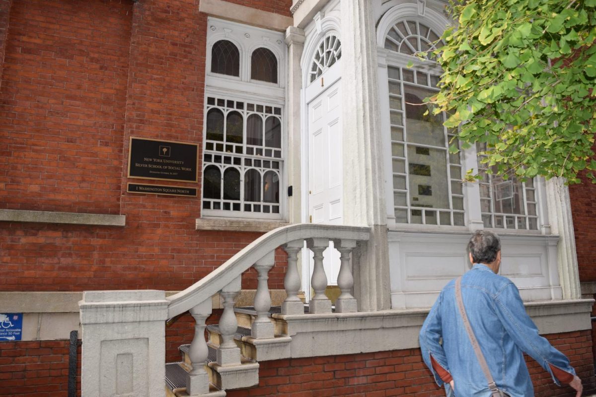
One might think that Collegiate Gothic architecture would entail buildings similar to the university’s Silver Center for Arts and Science or some of the decrepit dorm buildings in need of renovations. But true Collegiate Gothic architecture is a middle ground between old buildings that are falling apart and modern buildings that seem soulless. For example, NYU’s Casa Italiana on West 12th Street, the center of Italian culture on campus, has tried to capture part of the city’s history in its architecture. While it embodies more colonial architecture than Gothic, its arched windows, engaged columns and vaulted roofs carry that same nostalgic charm as Gothic buildings.
NYU should not be scared to explore more creative architectural options. While it is hard to completely return to one style, including certain aspects such as pointed arches and pinnacles, forming the crown of a small turnet are small ways that architects can pay tribute to the original Collegiate Gothic style. Architecture like this allows current students to have familiar-looking landmarks to call campus.
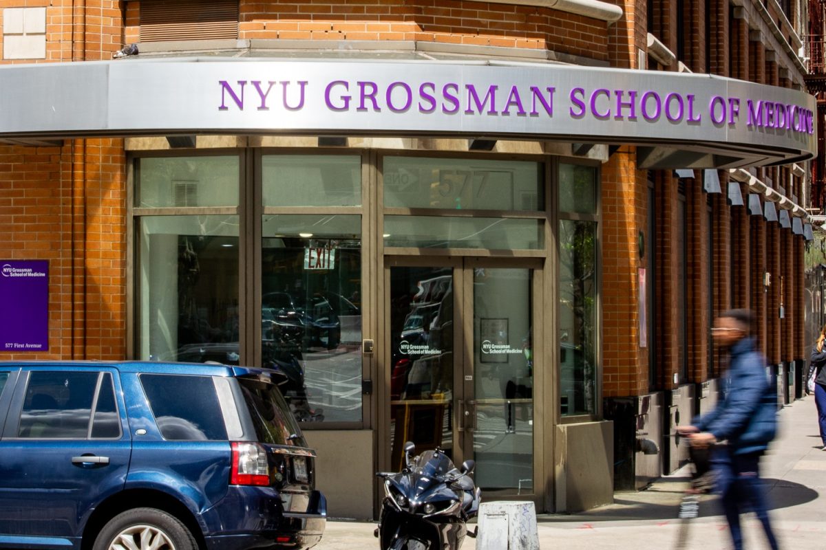
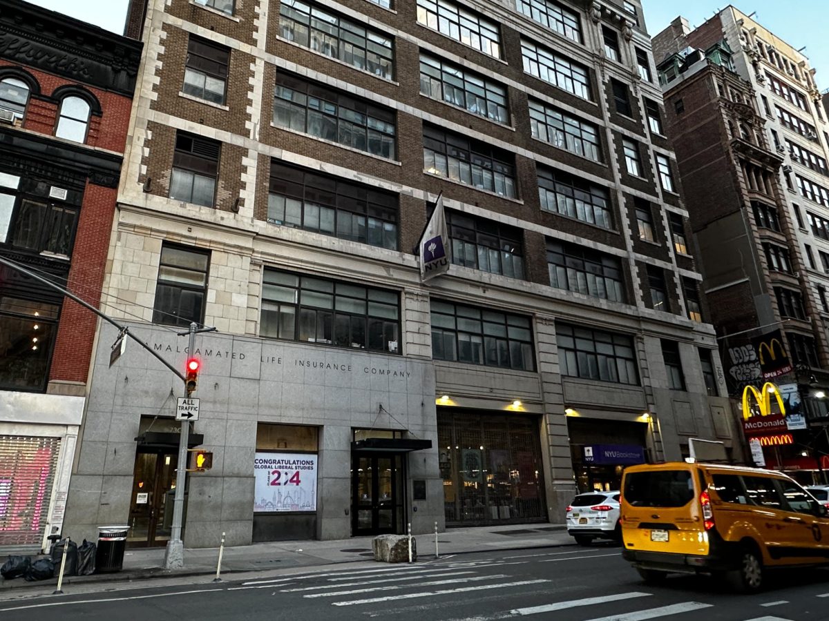
The new Paulson Center feels like a wasted opportunity to return to our Gothic Collegiate roots, and instead takes on a dystopian, modernist appearance. We shouldn’t have to settle for identifying university buildings by the tattered NYU flags hanging outside of them — we deserve ornate architecture instead.
WSN’s Opinion section strives to publish ideas worth discussing. The views presented in the Opinion section are solely the views of the writer.
Contact Mia Madonna at [email protected].

