


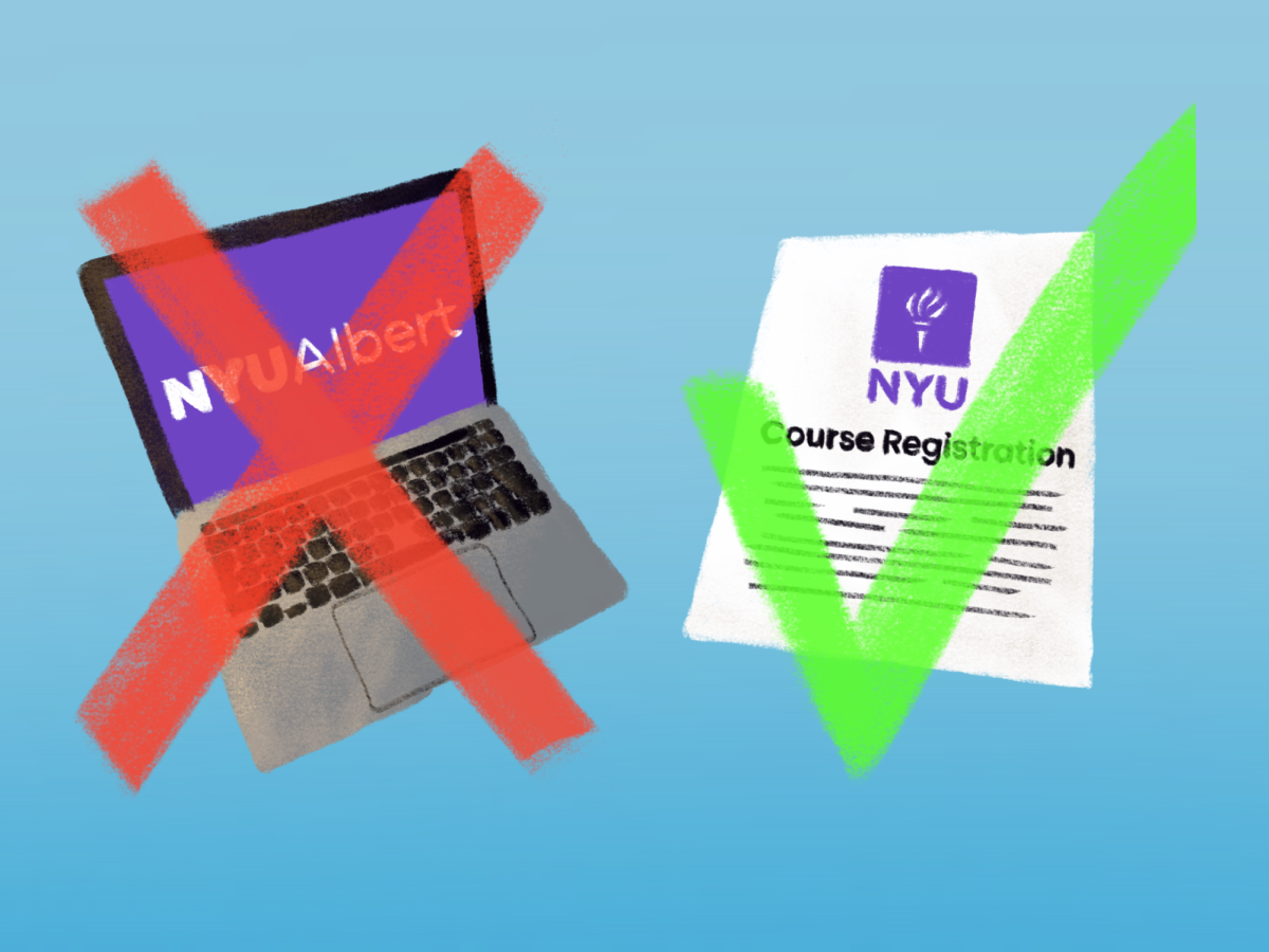


Opinion: Brightspace is poorly designed
Brightspace is supposed to be an efficient way to keep track of your classes, but Google Classroom just does it all better.
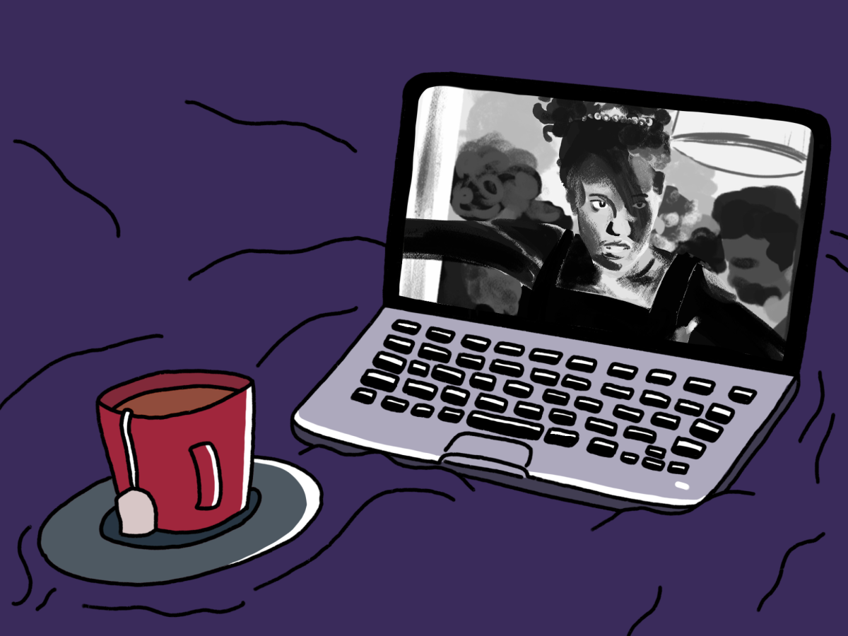
Google Classroom is a platform dedicated to education and classroom management. (Illustration by Susan Behrends Valenzuela)
November 8, 2022
Last year, NYU announced it was going to transition from NYU Classes to Brightspace, a platform developed by software company Desire2Learn. The FAS Office of Educational Technology announced the transition for the fall 2021 semester, claiming that the new platform would have better discussion boards, an easier grading mechanism, and more multimedia integration.
But from a student’s perspective, Brightspace just isn’t cutting it.
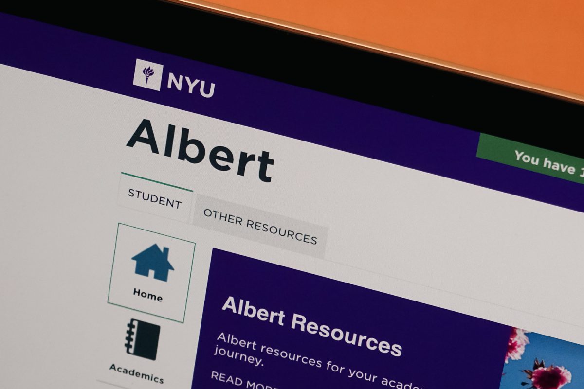
Open up Brightspace on any given day and you will find a confusing, cluttered dashboard with a list of your classes that takes up less than half the screen. It also has an awkward structure where it lists only two classes per row. The other half of the screen contains announcements and calendars, which in theory is a great addition, except that none of my professors seem to know how to correctly utilize these tools. It’s clunky and inefficient.
Appearance aside, Brightspace does not function well. The dashboard doesn’t categorize the upcoming assignments by class, but lists them on the side in a jumbled to-do list. The class boxes don’t contain useful information, but instead tell you the last day of class for the semester. That information could easily be written anywhere else, if it needs to be written at all. Moreover, you can’t even reorder your classes to reflect your schedule or priorities. At best, you can pin classes — but because of the two-class-per-row structure, if you pin more than two classes, you can’t see them all at the same time without scrolling down, which defeats the purpose. The feature is practically useless.
Navigation throughout Brightspace is extremely tedious. There’s no side toolbar like on other platforms, which means to go from class to class you have to go back to the homepage first and then click on the class you’re looking for. There’s a drop-down menu that lists all your classes, sure, but it covers a good third of the page when you click it. Lastly, there isn’t an accessible or convenient way to message your classmates, unless you attempt to use the convoluted Brightspace email system, which pales in comparison to Gmail.
Speaking of Google Apps, NYU should switch to a better system like Google Classroom. Google’s juggernaut software has been successful at the high school level and is a more elegant and efficient option to manage your due dates, upload your assignments and contact your professors and peers.
For busy college students who have to balance homework, jobs, clubs and social life, every click matters. And Google Classroom takes that into account. The platform’s homepage has one goal: to show you all your classes. That’s it. Each one gets a nice square that is significantly clearer to read than the Brightspace squares. Each square also directly shows you what assignment is due next, which is the kind of efficiency you need as a college student. On top of that, Google Classroom has a button to easily access the drive for that class’s files. That makes sorting through class files much simpler for the student.
More importantly, it has built-in integration with the Google Workspace. That includes Google Docs, which many NYU students use to keep track of their assignments, and Google Drive, which some professors are using anyway. So why not fully commit?
There are some arguments to be made in Brightspace’s defense. Its most useful concept by far is the notification drop-down menu, which Google Classroom currently lacks. It shows the last five announcements, including assignments and grade releases. Additionally, Brightspace is better integrated with Zoom, which is infinitely better than Google Meet. But these are all relatively minor benefits compared to what Google Classroom has to offer.
Whether the goal is discussion, easier grading or better class organization, Google Classroom knocks it out of the park. Brightspace is unfinished and sluggish in comparison. NYU should consider taking the leap.
WSN’s Opinion section strives to publish ideas worth discussing. The views presented in the Opinion section are solely the views of the writer.
Contact Anuj Jain at [email protected].