


NYU’s Website Is Now Device-Agnostic
August 28, 2016
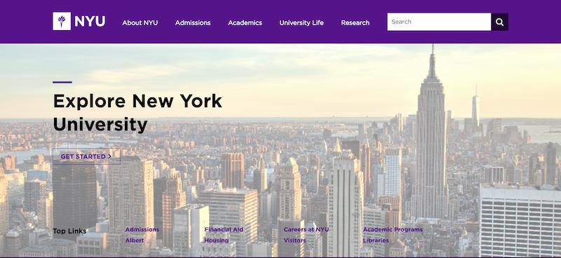
The NYU.edu website officially relaunched on Sunday with updated features for all electronic platforms. Executive Director of the Digital Communications Group Jim Robertson said that this was a much-needed renovation since nearly 30 percent of web traffic comes from mobile devices.
“We wanted to update our website to allow more opportunities to tell NYU’s story — one that is global, dynamic and ambitious — from both our website and our social media channels,” Robertson said. “The new design is the results of many months of work. The NYU Digital Communications team led the effort — with designers, developers and project management — but worked with many, many others at NYU.”
He said the Digital Communications Group consulted many of the 600 contributors to the website during this process, and they even formed a steering committee of high-ranking NYU community members — including the admissions office, the public affairs office, the IT team, faculty, students and administrators — to guide the website’s modernization process. Here’s a breakdown of the best new features NYU.edu has to offer.
Adaptable Design
The new web design allows the website to adapt to the screen it is on whether users are on a laptop, tablet or phone, which means no more pinching and zooming. Passages and pictures are set to resize according to the screen size, and the menu icon will show more detailed site navigation for mobile users.
Interactive Homepage
First impressions are important, so reconstructing the homepage is a great improvement. Visitors viewing the top half of the homepage can now access information regarding admissions, financial aid and educational opportunities while the bottom half will boast interactive features. Related news stories, events and social media will also be displayed while updated top searches will be on the site search box below.
Graphic Design, Photography and Typography
New shades of violet will appear, since violet closely associates with NYU’s brand. And to match the bustle of New York, photographs of movement and energy will also be featured. Inspired by the Port Authority Bus Terminal, headlines, titles and paragraph text will be in the Gotham font, while call-out text and page subheadings will be in Mercury.
Topic and Role Pages
To create structure for new users, there will be five topical channels: About NYU, Admissions, Academic, University Life and Research. Role pages will be divided among five different role-based sections: Students, Faculty, Alumni, Employees and Community. The student’s role page will assume a dashboard format and include Health and Wellness, Registration, Records, Graduations, Bills, Payments, Refunds as well as housing and dining which were previously located under the University Life section of the site.
Navigation
Computer users can hover their mouse over the header to activate a drop-down menu which will display an overview of that section as well as a secondary list of related links. By simply pressing the menu icon located on the top left corner of the screen, mobile users will also be able to access this feature. What was previously a secondary gray paneled menu on the top of the page will now feature the sub-navigation on the left sidebar of the main body content of the page.
A version of this article appeared in the Sunday, August 28 print edition. Email Ashley Arnold at [email protected].
