

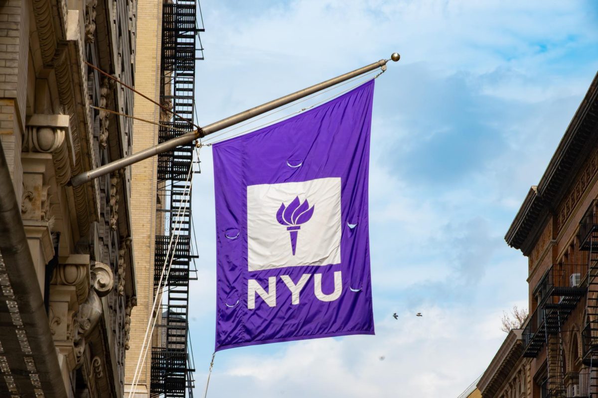





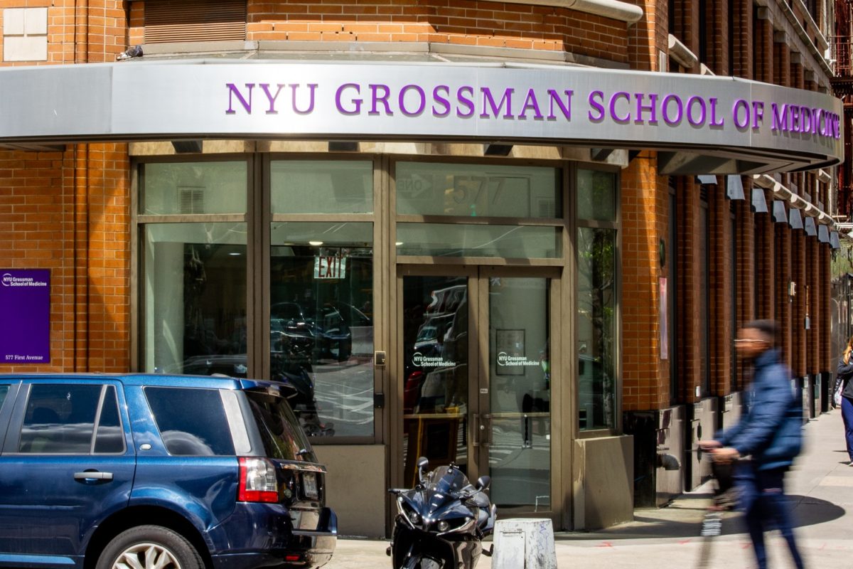
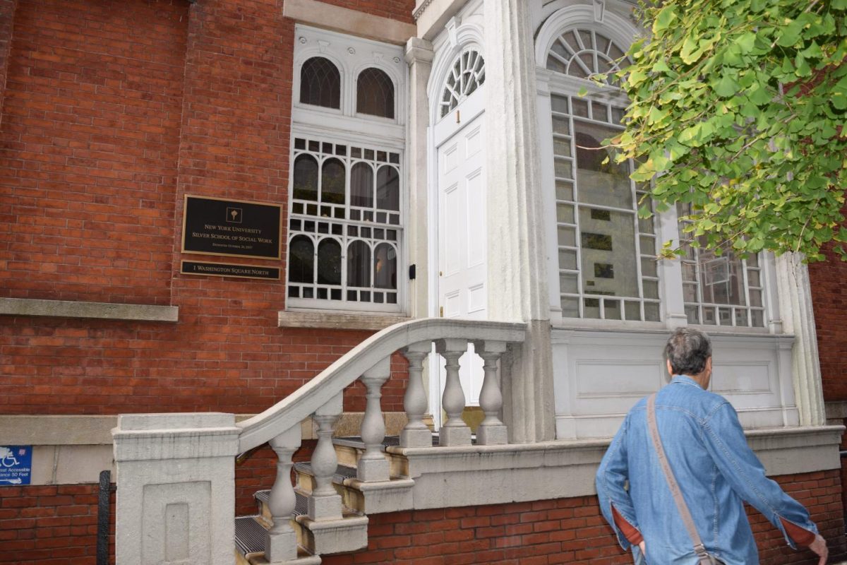





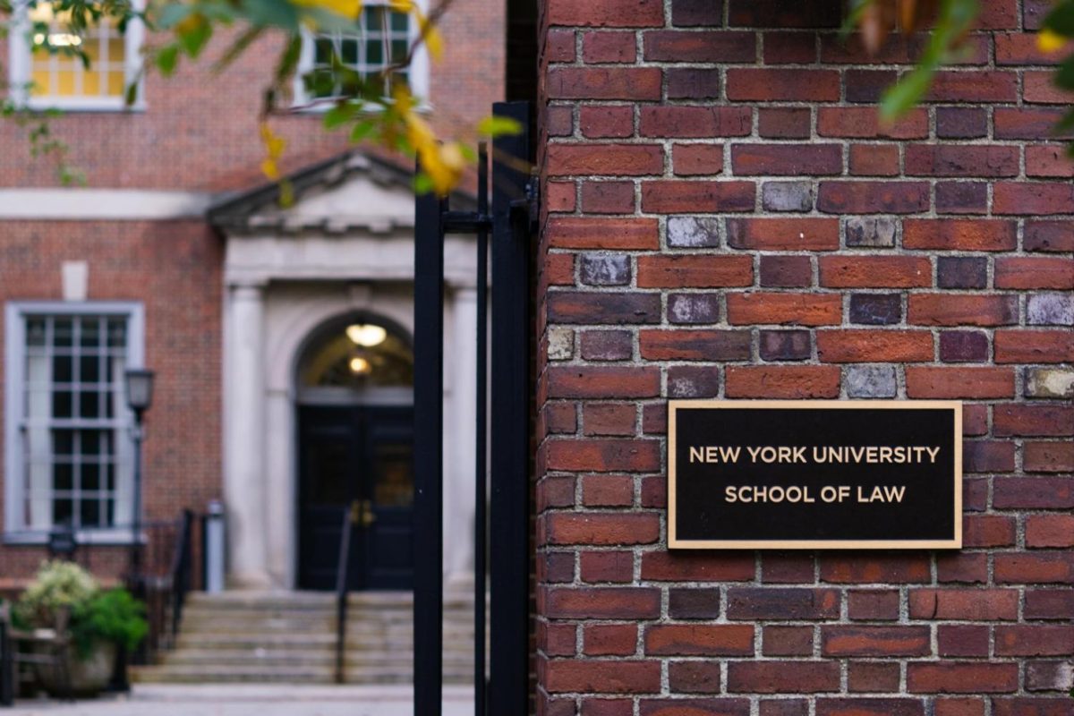



















From nearly every corner of Washington Square Park, you can see NYU’s bright purple flags rippling in the wind, their white torches catching the light as students walk underneath. The symbol is now synonymous with the university, but it is actually a relatively new addition to NYU’s identity — replacing the far more intricate seal that is now relegated to diplomas, corporate contracts and the occasional NYU Bookstore sweatshirt.
NYU began using its current logo in 1965 as part of efforts to modernize its brand. The university contacted graphic designer Tom Geismar, who administrators recognized for his involvement in the creation of the Chase Bank logo.
“The idea was to find a way to identify all these buildings,” Geismar, a founding partner of the graphic design firm Chermayeff & Geismar & Haviv — which has also designed logos for NBC, National Geographic and the United Nations Development Programme — told WSN. “It’s the banners that tie them all together — I think it really works in the context of city schools.”
While developing the torch design, Geismar took apart the individual components of the university seal, which NYU had been using as its logo since 1897. The seal displays the university’s name, founding year in Roman numerals, its Latin motto, four runners rushing to place a laurel wreath on a pedestal and the Statue of Liberty’s upheld torch. The origins of NYU’s seal are unknown, but many American universities adopted the European tradition in the 18th and 19th centuries, after orders from boards of trustees or chancellors.
The athletes represent the continued pursuit of academic excellence, while the wreath represents victory. The motto, “perstare et praestare,” means “to persevere and to excel.” The final element of the university seal — Lady Liberty’s torch — signifies “NYU’s commitment of service to New York City,” channeling the vision founder Albert Gallatin had for NYU to be a university “in and of the city.”
“You always had the torch up above in the seal, and it seemed like taking the torch — which is a symbol of knowledge — and making something of that in a clear way made sense,” Geismar said. “We did some other torch variations, but this one seemed to be simple and striking.”
In 1911, philanthropist Helen Miller Gould, who graduated from the NYU School of Law in 1895, gifted the university a five-pound sterling silver torch modeled after Lady Liberty’s. Designed by Tiffany & Co., the torch was intended for commencement processions, where a senior faculty member would pass the torch to the youngest undergraduate degree candidate.
The tradition was briefly retired until the university decided to revive it, tasking one individual with igniting the flame and ensuring students’ safety. For 30 years, former CAS Senior Director of Technical Services John DeSantis would walk behind the torch bearer with a fire extinguisher after six decades at the university.
Besides the torch, the logo includes a background of violet, the university’s principal brand color and unofficial mascot. The origins of NYU’s colors are debated — the colors may have been inspired by the violets frequently planted around Washington Square Park in the 1880s or chosen for the flower’s association with ancient Athens as a symbol of education and knowledge.
Another story, according to a letter in the university archives, claims that NYU’s original main building — which was replaced by the Silver Center for Arts and Science in 1894 — was inspired by the the King’s College chapel at Cambridge University, whose official colors are violet and white.
“As a small kid, I went to a YMCA summer camp and the counselors were mostly part of the NYU basketball team, spending their summers there,” Geismar said. “At that time, NYU had one of the best basketball teams in the country and was always known as the Violets — the color has been there a long time as the color of the university.”
The color violet itself is often associated with wisdom, while white symbolizes clarity or purity. Today, the university describes the contrast of the white torch on the purple background as a representation of finding light in the darkness, or “enlightenment through education.”
“In doing a logo, we’re always looking for something that could last for many years, and not just be what is the current style,” Geismar said. “It’s one that we’re proud to have done, and I think it still works in a very different context today.”
Contact Selin Kemiktarak at [email protected].