The Paradigm Shifts of Album Artwork
April 6, 2017
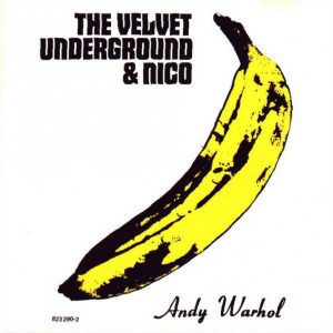
It’s 1970, and you’re in a record store stroking through never-ending crates of records lining every aisle. An album’s artwork possesses the ability to either grab consumers’ attention or cause them to continue skimming. Artwork could drastically impact sales, and as a result, album artwork was overtly eye-catching — often utilizing tactics such as bright, shocking and sexualized images. Some covers even became works of art themselves — think the Velvet Underground’s iconic Andy Warhol banana.
But in today’s digital domains, the function of album artwork itself differs. While eye-catching moments are found in publicity stunts and artists are often sexualized in music videos, a consumer likely views an album cover on their smartphone only once they are already listening to the product. It is merely an afterthought.
In lieu of previous pressures to bolster sales, more freedom exists nowadays for album artwork. 2015 marked a shift in the music industry’s landscape when the total revenue from digital consumption surpassed physical retail for the first time. The transition from physical to digital sales is well-documented, and streaming has most recently affected a wide array of aspects of the industry. However, in today’s digital domains, one paradigm shift often unnoticed is how album cover art has changed alongside the shift in format preference.
Consider the evolution of Drake’s cover art. Some may perceive 2016’s “Views,” a miniscule image of Drake perched on the CN Tower, as bland and complacent. However, here he has freed himself from selling his looks as he did on his 2010 debut “Thank Me Later,” which depicted his clean-cut face. On “Best I Ever Had,” a single from a mixtape prior to the release, he even rapped “I could probably sell a blank disk / when my album drop [women] will buy it for the picture.”
Furthermore, the shift from physical to digital has allowed cover art to be branded far less obviously.
Now, it’s 1990, and you’re combing through bottomless shelves of CDs. If you couldn’t figure out what an album was, you would likely glaze over it. In this way, including an artist’s name and the title of their work was almost a foregone conclusion.
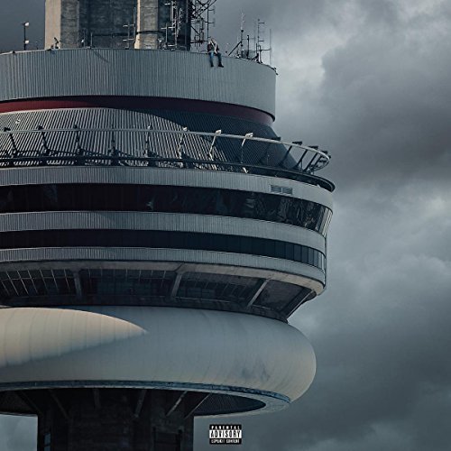
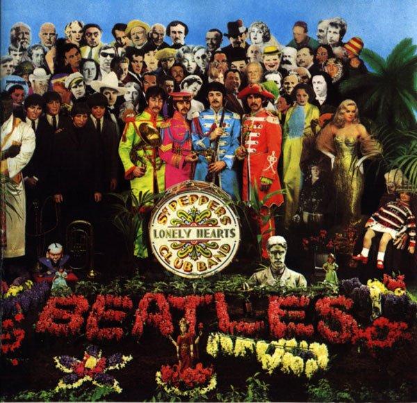
Today, however, when viewing an album on most digital music applications, an artist’s name and the title of their work are already listed elsewhere on the interface. Including the information on the artwork becomes redundant. As a result, it has become increasingly popular for album artwork to not incorporate the information at all, allowing artists to use the entire space more freely. In fact, out of the four best-selling albums of 2016 — Drake’s “Views,” Adele’s “25,” Beyonce’s “Lemonade” and Rihanna’s “Anti” — none of their covers contain the respective artists’ names, and only “Lemonade” contains the title. However, this change does not come without possible drawbacks, and certain traditions may fade as artists find more and more creative ways to incorporate text into art, such as the Beatles did in their 1967 release of “Sgt. Pepper’s Lonely Hearts Club Band.”
Perhaps the album artwork that utilized its newfound freedom the most — or perhaps the least — was that of Kanye West’s 2013 release “Yeezus.” The album shipped to physical retail in a clear case with no artwork at all. And even though the digital artwork is now simply a photograph of his artless product, it has become artwork in its own right. West’s creative director Virgil Abloh explained in an interview with XXL magazine that “it represented the death of a CD. It’s an open casket for a format of music we were raised off of.”
Like the rest of the world, the music industry is changing drastically to adapt to technological change, and many major artists are leading the musical transformation by redefining industry standards. Kanye West’s latest album “The Life of Pablo” was continually updated in the months following the physical album’s release to demonstrate “a living breathing changing creative expression.” And Drake’s most recent originals were simply released as a playlist. These prominent precedents challenge and alter the very concept of an album. Subsequently, so does album artwork. Does the cover of “Views” positively illustrate Drake’s newfound freedom to use artwork to depict his albums’ concepts rather than selling his looks? Or does it negatively illustrate how today’s covers’ lack of impact on commercial performance has led to more boring and complacent artworks? Was the art for “Yeezus” — or lack thereof — a brilliant ode to CDs, which showcased the beauty and universal familiarity of the reflecting aluminum-encased polycarbonate plastic? Or was he just too lazy to find actual artwork?
Like all art, the answers to these questions are subjective. Nevertheless, it is certainly intriguing to see how album artwork will further evolve alongside both music and technology in the years to come. Now it’s the twenty-teens, as you’re scrolling through Spotify albums — and you’re not sure what to look for.
A version of this article appeared in the Thursday, April 6 print edition.
Email Satish Reginald at [email protected].


